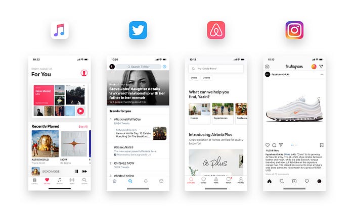
Open your favorite app. Then open another one. Chances are, they both look eerily similar.
Scroll through your favorite apps today — Instagram, Threads, TikTok, YouTube Shorts, LinkedIn. Notice something? They all start to blur together.
Rounded cards. Bottom navigation bars. Neutral pastels or sleek gradients. A safe sans-serif font like Inter or Roboto. Scroll enough, and you'll start to wonder: did the same team design all of them?
Now step offline. Look at your laptop, your phone, your smartwatch, your wireless earbuds. Can you honestly tell them apart at a glance? Most are sleek rectangles, brushed aluminum or glass, with rounded corners. Even cars once full of bold identities are converging into aerodynamic blobs designed for efficiency.
It's not your imagination. From websites to apps, even physical products — everything is converging into a kind of "global design template." Clean, functional, predictable. But also… boring.
We're living in a time where innovation often feels like iteration, and originality gets sanded down in the name of scalability, safety, and familiarity.
Why did design, once a playground of experimentation and rule-breaking, start to look like a template kit? And more importantly, what can we do about it?
The What
Design wasn't always this monotonous. In the early web (the 2000s), every website looked different… sometimes messy, often chaotic, but unique. Early smartphones carried distinct personalities: BlackBerry's tiny keyboard, Nokia's playful forms, Apple's minimal metal.
Fast forward to today:
- Websites follow the same hero-image + call-to-action pattern.
- Apps mirror Material Design or Human Interface Guidelines with little deviation.
- Physical products — cars, phones, even furniture — seem designed from the same Pinterest board.
This isn't just perception. A 2020 study by the Nieman Lab found that online news sites had become "almost indistinguishable" in layout. Another analysis by UX Collective revealed how most top apps reuse the same visual hierarchy and interaction flows.
Sameness is now the default.
The Why: How Did We Get Here?
Design Systems & Guidelines
Google's Material Design and Apple's HIG (Human Interface Guidelines) were created to bring clarity and consistency. They worked almost too well. Designers leaned on them not just for structure, but for creative decisions.
Result? Everything looks "usable," but little looks unique.
Material Design now influences more than 70% of the world's most-used apps.
Designers love usability heuristics, Material Design, and Apple's HIG. But the more we adhere to guidelines, the more predictable everything becomes.
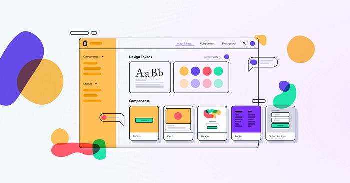
Kits & Templates
Figma's community files are a gift: need a dashboard? There's a template. Need an onboarding flow? Downloadable in minutes.
Tools like Figma, Webflow, Canva, and Squarespace democratized design. That's a win. But it also meant many designs start from the same pre-built templates. When speed > originality, the result is a flood of lookalike websites, apps, and portfolios.
The problem? These "shortcuts" spread like wildfire. What was meant as a head start often becomes the final product.
Data-Driven Decisions
A/B testing rewards safety. The "weird" option rarely wins. Rounded buttons perform better than sharp ones. Blue links get more clicks.
Over time, design becomes less about imagination and more about optimization. Creativity bows down to conversion rates.
Globalization of Taste
Social media, Dribbble, and Behance created an aesthetic monoculture. A designer in São Paulo, Berlin, or Bangalore is exposed to the same "hot trends" and pressured to follow them.
The result? A worldwide echo chamber of neumorphism, glassmorphism, and now bento grids.
Minimalism, once revolutionary, has become the default. Skeuomorphism gave way to flat design. Flat became "neumorphism." Then we circled back to "flat but colorful."
Minimalism sells because it feels "premium" and "timeless." But overuse turned it into aesthetic beige.
Think about the logos of Airbnb, Uber, Spotify, Google, Pinterest, and countless startups. All once unique, now all flattened sans-serif wordmarks.
Fear Factor
No one wants to explain "why we tried something different" in a boardroom. Safe design = fewer risks. And in corporate environments, risk-aversion often trumps originality.
Algorithms rewarding sameness
Instagram pushes content that looks like what worked before. TikTok clones successful formats endlessly. Even Medium articles often mirror each other structurally (headings, bullet points, "story + insight" formula).
When platforms reward conformity, creators conform.
The How: Breaking Out of the Sameness
Revisit the Roots
Remember, design isn't just decoration. It's problem-solving, communication, and cultural expression. Ask: does this design reflect the brand, the user, the context? Or just the trend?
Contextual Inspiration
Instead of scrolling Dribbble for inspiration, look at:
- Local crafts and art forms
- Architecture
- Historical interfaces (retro UIs often spark fresh ideas)
- Everyday objects (the way a metro map simplifies complexity, or how street signage uses hierarchy)
Design for the Edges, Not Just the Center
Design systems account for the "average" user. Innovation happens when you design for the outliers. Accessibility, local languages, low-bandwidth scenarios these often push designers to break patterns and create new ones.
Experiment in Safe Zones
You don't need to reinvent the home screen of a banking app. But can the onboarding flow be playful? Can microcopy break norms? Can illustrations reflect cultural diversity? Small risks compound into big character.
Educate Clients & Stakeholders
The sameness problem isn't just designers it's also clients who say, "Make it look like B Company or C Enterprise." Teaching them the value of differentiation is part of the job.
Bring back context
Not every app needs to look like Instagram. Not every logo has to be Helvetica-inspired. Revisit cultural context — what makes this product local, human, specific?
Example: Duolingo's playful owl mascot breaks the mold by leaning into fun, not just flat minimalism
Dare to be opinionated
Design isn't just about pleasing everyone. Bold, opinionated design stands out. Look at Notion — block-based editing wasn't obvious, but it became a cult favorite.
Explore imperfection
Humans connect with quirks. That's why handwritten typefaces, asymmetry, or "brutalist" web design sometimes feel refreshing.
Example: Craigslist hasn't changed in decades. Ugly? Yes. But instantly recognizable.
Reclaim diversity
Global platforms may converge, but local designers can reintroduce cultural flavor. Typography inspired by Devanagari, African geometric patterns, or Japanese minimalism — all have a place in modern design.
Real-World Examples of Breaking Sameness
- Notion: Instead of mimicking Google Docs, it leaned into modularity and blank-slate freedom.
- Dyson: Appliances that don't look like anything else in the category.
- IKEA Instructions: Universally recognizable, with no words — only visuals.
- Indian Railways UPI QR Codes: Not pretty, but uniquely adapted to context (stickers on train berths and chai cups).
These aren't just products. They're statements.
Did You Know?
- The most popular fonts on the web (Roboto, Open Sans, Inter) account for more than 70% of live websites.
- A 2019 Nielsen Norman Group survey found that "users often assume two apps are from the same company if their design patterns are too similar."
- Netflix's "Skip Intro" button, a simple break from tradition, became one of its most loved UX innovations.
The Irony of Sameness
The push for accessibility, usability, and inclusivity are all noble goals, unintentionally flattened design's personality. The irony is that in making things easy for everyone, we risk making them memorable to no one.
Where Do We Go From Here?
AI-powered design tools like MidJourney, Uizard, and Galileo AI are revolutionizing the creative process. But left unchecked, they risk training on today's trends and endlessly recycling them. The result? A wave of homogenized, predictable outputs.
Yet we have a choice.
The future of design hinges on how we use these tools — as shortcuts for convenience or as springboards for innovation. Will we design for novelty and usability, or let automation dictate aesthetics?
At its core, design is not about sameness. It's about meaning.
While current AI tools often produce uniform results, they also hold the potential for hyper-personalized experiences. Imagine interfaces uniquely styled for each user — tailored not just to function, but to identity.
We're already seeing signs of change:
- Post-minimalism is emerging — vibrant gradients, maximalist layouts, and nostalgia-driven skeuomorphism (hello, iOS 16 widgets).
- Local voices are rising — as global design fatigue sets in, culturally rooted aesthetics are making a comeback.
The problem of sameness won't disappear overnight. But awareness is the first step. Designers who dare to experiment — who challenge the defaults — will lead the next wave.
Let's use AI not to replicate the past, but to reimagine the future.
Closing Thought
The next time you're tempted to copy a Figma kit or mimic a trend, pause and ask: What's my fingerprint here? What makes this ours, not theirs?
Sameness is safe.
Difference is dangerous.
But design is also about delight, surprise, and expression. If everything looks the same, we risk losing the joy of interaction.
The challenge for today's designers isn't just building functional products — it's reintroducing diversity, quirks, and personality into a world that's too quick to sand down the edges.
Because in the end, different is memorable. And memorable is what lasts.
Until next time, Waffle Designs 🧇 Follow along for design tips, ideas, and chaos 😘
🔗 Connect with me: LinkedIn | Instagram | Twitter
📬R