Knowing the underlying data distribution is a crucial step in data modeling, with numerous applications, including anomaly detection, synthetic data generation, and data compression.
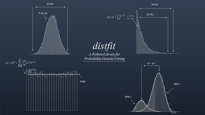
Determining the underlying (probability) distribution for your data has many modeling advantages. Examples are in decision making, statistical inferences, and predictive modeling, among others. In general, the easiest manner to determine the underlying distribution is by visually inspecting the random variable(s) using a histogram. However, to determine the exact distribution with its parameters (e.g., loc, scale), it is essential to use quantitative methods. If we know the theoretical distribution, we can create various plots that are helpful to gain more insights and understanding of our variables, such as the Probability Distribution Function plot (PDF/CDF), and the QQ plot. In this blog, I will describe why it is important to determine the underlying probability distribution for your data set. But also explain what the differences are between parametric and non-parametric distributions. I will demonstrate with hands-on examples how to find the best fit using a quantitative approach and then how to confirm it using visual inspections. All analyses are performed using the distfit library, and a notebook is provided for easy access and experimenting.
If you like the content, give it applause, and you are welcome to follow me because I write more about data science! Tip: the hands-on examples in this blog. This will help you to learn quicker, understand better, and remember longer. Grab a coffee and have fun! Disclosure: I'm the author of the Python package distfit library.
The Importance Of Distribution Fitting and Probability Density Functions.
The probability density function (PDF) is a fundamental concept in statistics that is important to understand. In general, there is a lot of material available that describes the concepts of PDFs [1]. Despite all the available information, it can remain challenging to understand why it is important to know the underlying data distribution for your data set. Let me try to explain the importance with a simple analogy. Suppose you need to go from location A to B. Which type of car would you prefer? The answer is straightforward. For an optimal ride, you first need to know the terrain, right? With that information, you can then select the best-suited car (sports car, four-wheel drive, etc). Logically, a sports car is better suited for smooth, flat terrain, while a four-wheel drive is better suited for rough, hilly terrain. In other words, without the exploratory analysis of the terrain, it can be hard to select the best possible car. Such an exploratory step is easily forgotten or neglected in data modeling. So how does this now relate to PDFs?
Before making data modeling decisions, you need to know the underlying data distribution.
When it comes to data, it is important to also explore the fundamental characteristics of the data. Think of skewness, kurtosis, outliers, distribution shape, univariate, bimodal, etc. Based on these characteristics, it is easier to decide which models are best to use because most models have prerequisites for the data. As an example, a well-known and popular technique is Principal Component Analysis (PCA). This method computes the covariance matrix and requires the data to be multivariate normal for the PCA to be valid. In addition, a PCA is also known to be sensitive to outliers. Thus, before doing a PCA step, you need to know whether your data needs a (log)normalization or whether outliers need to be removed. More details and hands-on examples about PCA can be found in the underneath blog. Other terminologies can be found at the bottom of this blog.
Histograms Build A Sense Of Intuition.
The histogram is a well-known plot in data analysis, which is a graphical representation of the distribution of a variable. A histogram simply summarizes the number of observations that fall within the bins. We can easily change the number of bins, and visually inspect the shape of the histogram and determine whether the density looks like a known probability distribution. A visual inspection will also give hints about skewness, the number of peaks, or outliers. With libraries such as matplotlib, and its hist() functionalities, it is straightforward to make visual inspections of the data. In most cases, you will observe a distribution shape as depicted in Figure 1.
- A bell-shaped distribution. Such as the Normal distribution.
- A descending or ascending shape. Such as the Exponential or Pareto distributions.
- A flat shape. Such as the Uniform distribution.
- A complex shape. A distribution that does not fit any of the theoretical distributions (e.g, multiple peaks).
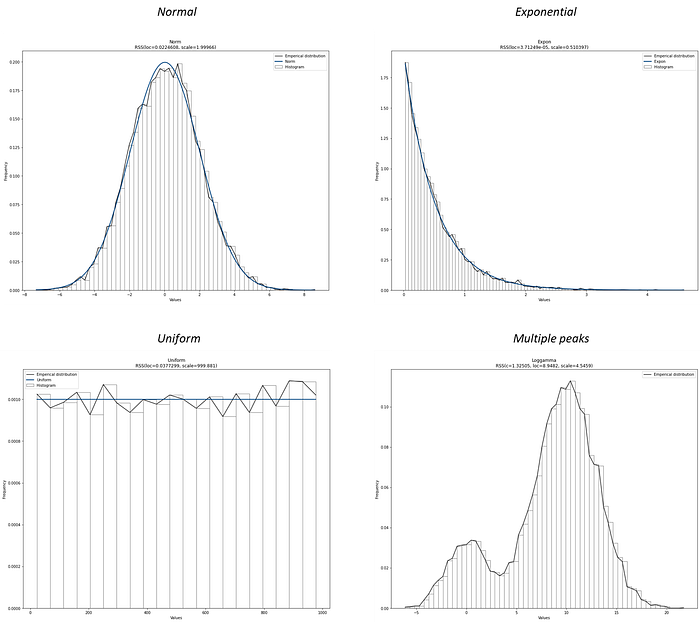
When distributions contain multiple peaks in your histogram (bimodal or multimodal), you can stress test the distribution by changing the number of bins. A theoretical distribution has stable peaks, and therefore, the peaks should remain stable and thus not disappear with different numbers of bins. Bimodal distributions usually hint toward mixed populations. In addition, if you observe large spikes in density for a given value or a small range of values, it may point toward possible outliers. Outliers are generally expected to be far away from the rest of the density.
A histogram is a great way to inspect your samples (random variables or data points). However, as the number of samples increases or when multiple histograms are plotted, the visuals can become cluttered and harder to interpret. It also becomes more difficult to visually assess how well a theoretical distribution fits the data. In such cases, plots like the Cumulative Distribution Function (CDF) or the Quantile-Quantile (QQ) plot are a more structured way to compare the empirical data to a theoretical distribution. However, these plots assume that a specific theoretical distribution is already known. So before we can use them, let's first determine which theoretical distribution best fits the data in the next section.
Determine The Theoretical Distribution In Four Steps.
The best fit for the Probability Density Function (PDF) based on the empirical data can be determined with the following four steps:
- Compute the histogram density and weights. The first step is to flatten the data into an array and create the histogram by grouping observations into bins and counting the number of events in each bin. The choice of the number of bins is important as it controls the coarseness of the distribution. Coarseness refers to how detailed or smooth the histogram appears. Fewer bins make the distribution look blocky and oversimplified, while more bins reveal finer structure but may also introduce noise. Experimenting with different bin sizes can provide multiple perspectives on the same data. In
distfit, the bin size can be defined manually or mathematically determined on the observations themselves. The latter option is the default. - Estimate the distribution parameters from the data. In a parametric approach, the next step is to estimate the shape, location, and scale parameters based on the (selected) theoretical distribution(s). This typically involves methods such as Maximum Likelihood Estimation (MLE) to determine the values of the parameters that best fit the data. For example, if the normal distribution is chosen, the MLE method will estimate the mean and standard deviation of the data.
- Check the goodness-of-fit. Once the parameters have been estimated, the fit of the theoretical distribution is evaluated. This can be done using a goodness-of-fit test. Popular statistical tests are Residual Sum of Squares (RSS, also named SSE), Wasserstein, Kolmogorov-Smirnov, and the Energy test(all available in distfit).
- Selection of the best theoretical distribution. At this point, all theoretical distributions are tested and scored using the goodness-of-fit test statistic. The scores can now be sorted, and the theoretical distribution with the best score is selected.
At this point, we determined the best theoretical distribution for the data. However, it is also recommended to validate the model using methods such as cross-validation, bootstrapping, or a holdout dataset. The reasoning is to determine whether the model is generalizing, and if assumptions such as independence and normality are met. With the theoretical distribution that has been fitted and validated, we can use it in many applications. Keep on reading in the next section, where I will demonstrate the fitting of PDFs with hands-on examples.
Distribution fitting has great benefits when working in the field of data science. It is not only to better understand, explore, and prepare the data but also to bring fast and lightweight solutions.
The Distfit Library.
Distfit is a Python package for probability density fitting of univariate distributions for random variables. It can find the best fit for parametric, non-parametric, and discrete distributions. In addition, various plots can easily be created for improved insights and decision-making. A summary of the most important functionalities is as follows:
- Fitting: Determine the best fit for parametric, non-parametric, and discrete distributions.
- Predict: Make predictions, detect outliers, and novelties for unseen samples.
- Synthetic data: Generate synthetic data based on the fitted distribution [9].
- Plots: Histograms, Probability Density Function plots, Cumulative Density Function plots (CDF), Histograms, Quantile-Quantile plots (QQ-plot), Probability plots, and Summary plots.
- Saving and loading.
With the distfit library it is easy to determine the best theoretical distribution with only a few lines of code.
Installation of distfit is straightforward:
pip install distfitHow to Identify The Best Fit Using Parametric Fitting?
With parametric fitting, we make assumptions about the parameters of the population distribution from the input data. In other words, the shape of the histogram should match a known theoretical distribution. The advantage of parametric fitting is that it is computationally efficient, and the results are easy to interpret. The disadvantage is that it can be sensitive to outliers with a low number of samples. The distfit library can determine the best fit over 90 theoretical distributions, for which many are utilized from the scipy library. To determine the best fitting PDF, multiple goodness-of-fit statistical tests are available, among others: Residual Sum of Squares (RSS or SSE), Wasserstein, Kolmogorov-Smirnov (KS), and Energy. For each fitted theoretical distribution, the loc, scale, and arg parameters are returned. For example, for a Normal distribution, the mean and standard deviation are returned.
Finding the best matching theoretical distribution for your data set requires a goodness-of-fit statistical test.
For demonstration, let's generate data from the normal distribution with mean=2 and standard deviation=4, and estimate these two parameters from the data itself. Because we already know the answer, it will help to understand the exact working. For example, in distfit we can set the family of distributions that we expect (e.g., bell-shaped). The default is a subset of common distributions (as depicted in Figure 1). See code block below. Note that due to the stochastic component, results can differ from what I am showing when repeating the experiment.
# Import libraries
import numpy as np
from distfit import distfit
# Create random normal data with mean=2 and std=4
X = np.random.normal(2, 4, 10000)
# Initialize using the parametric approach.
dfit = distfit(method='parametric')
# Alternatively limit the search for only a few theoretical distributions.
dfit = distfit(method='parametric', distr=['norm', 'expon'])
# Fit model on input data X.
dfit.fit_transform(X)
# Print the bet model results.
dfit.model
{'name': 't',
 'score': 0.000270365694642333,
 'loc': 1.9936231440200256,
 'scale': 3.9894747851891967,
 'arg': (286112103.0318819,),
 'params': (286112103.0318819, 1.9936231440200256, 3.9894747851891967),
 'model': <scipy.stats._distn_infrastructure.rv_continuous_frozen at 0x1c692bf0d70>,
 'bootstrap_score': 0,
 'bootstrap_pass': None,
 'color': '#e41a1c',
 'CII_min_alpha': -4.568478947276924,
 'CII_max_alpha': 8.555725235316974}
The best fit that is detected (i.e., with the lowest RSS score) is the t-distribtion. The results of the best fit are stored dfit.model but we can also inspect the fit for all other PDFs as depicted in dfit.summary (see code section below) and create a plot (Figure 2A).
# Print the scores of the distributions:
dfit.summary[['name', 'score', 'loc', 'scale']]
#           name     score                loc         scale
# 0            t   0.00027           1.993623      3.989475
# 1         norm   0.00027           1.993622      3.989474
# 2         beta  0.000272        -146.362892    258.193663
# 3     loggamma  0.000276        -674.685933    103.854194
# 4        gamma  0.000277        -444.773628      0.035642
# 5      lognorm  0.000292        -257.026833    258.996001
# 6   genextreme  0.000981           0.478883      3.970304
# 7     dweibull  0.002736           1.868224      3.406896
# 8      uniform  0.078719         -13.563371     30.932637
# 9        expon  0.109238         -13.563371     15.556992
# 10      pareto  0.109238 -1073741837.563371  1073741824.0

# Plot the RSS of the fitted distributions.
dfit.plot_summary()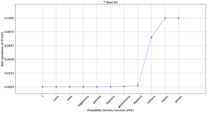
But why did the normal distribution not have the lowest Residual Sum of Squares despite we generated random normal data?
Well, first of all, our input data set will always be a finite list that is bound within a (narrow) range. In contradition, the theoretical (normal) distribution goes to infinity in both directions. Secondly, all statistical analyses are based on models, and all models are merely simplifications of the real world. Or in other words, to approximate the theoretical distributions, we need to use multiple statistical tests, each with its own (dis)advantages. Finally, some distributions have a very flexible character, where certain parameter can converge towards other distribution [3].
The result is that the top 7 distributions have a similar and low RSS score, among them the normal distribution. We can see in the summary statistics that the estimated parameters for the normal distribution are loc=1.99 and scale=3.98, which is very close to our initially generated random sample population (mean=2, std=4). All things considered, very good results!
Bootstrapping for more confidence.
We can validate our fitted model using a bootstrapping approach and the Kolmogorov-Smirnov (KS) test to assess the goodness of fit [8]. If the model is overfitted, the KS test will reveal a significant difference between the bootstrapped samples and the original data, indicating that the model is not representative of the underlying distribution. In distfit, the n_bootst parameter can be set during initialization or afterward (see code section).
# Set bootstrapping during initialization.
# dfit = distfit(method='parametric', n_boots=100)

# Bootstrapping
dfit.bootstrap(X, n_boots=100)
# Print
print(dfit.summary[['name', 'score', 'bootstrap_score', 'bootstrap_pass']])
#           name     score  bootstrap_score bootstrap_pass
# 0            t   0.00027              1.0           True
# 1         norm   0.00027              1.0           True
# 2         beta  0.000272              1.0           True
# 3     loggamma  0.000276              0.9           True
# 4        gamma  0.000277              0.6           True
# 5      lognorm  0.000292              0.5           True
# 6   genextreme  0.000981              0.0          False
# 7     dweibull  0.002736              0.0          False
# 8      uniform  0.078719              0.0          False
# 9        expon  0.109238              0.0          False
# 10      pareto  0.109238              0.0          False
# Plot the RSS and bootstrap scores of the fitted distributions.
dfit.plot_summary()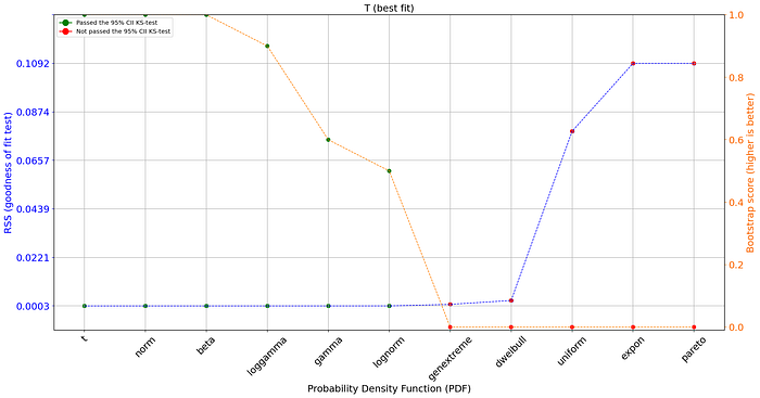
The plot contains on the left axis the goodness of fit test and on the right axis (orange line) the bootstrap result. The bootstrap score is a value between [0, 1] and depicts the fit-success ratio for the number of bootstraps and the PDF. In addition, the green and red dots depict whether there was a significant difference between the bootstrapped samples and the original data. The bootstrap test now excludes a few more PDFs that showed no stable results.
It is good to realize that the statistical tests only help to look in the right direction, and that choosing the best model is not only a statistical question; it is also a modeling decision [4]. Think about this: the t-distribution is heavily tailed, while the normal-distribution is not. This can make a huge difference when using confidence intervals and predicting outliers in the tails. Choose your distribution wisely so that it matches the application.
Choosing the best model is not only a statistical question; it is also a modeling decision.
Visual Inspections Guide Towards Better Decisions.
A best practice is to use both statistics and a visual inspection to decide what the best distribution fit is. Using the PDF/CDF and QQ plots can be some of the best tools to guide those decisions. As an example, Figure 2B illustrates the goodness-of-fit test statistics for which the first 8 PDFs have a very similar and low RSS score. The dweibull-distribution is ranked number 8, with a low RSS score. However, in the next hands-on example we will create a visual inspection that will learn us that, despite having a relatively low RSS score, it is not a good fit after all.
Let's start plotting the empirical data using a histogram and the PDF. These plots will help to visually guide whether a distribution is a good fit. We can see in Figure 3 the PDF (left) with the confidence intervals, and on the right side the CDF plot. The confidence intervals are automatically set to 95% CII but can be changed using the alpha parameter during initialization. When using the plot functionality, it automatically shows the histogram in bars and with a line, PDF/CDF, and confidence intervals. All these properties can be manually customized (see code section below).
import matplotlib.pyplot as plt
# Create subplot
fig, ax = plt.subplots(1,2, figsize=(25, 10))
# Plot PDF with histogram
dfit.plot(chart='PDF', ax=ax[0])
# Plot the CDF
dfit.plot(chart='CDF', ax=ax[1])

# Change or remove properties of the chart.
dfit.plot(chart='PDF',
          emp_properties=None,
          bar_properties=None,
          pdf_properties={'color': 'r'},
          cii_properties={'color': 'g'})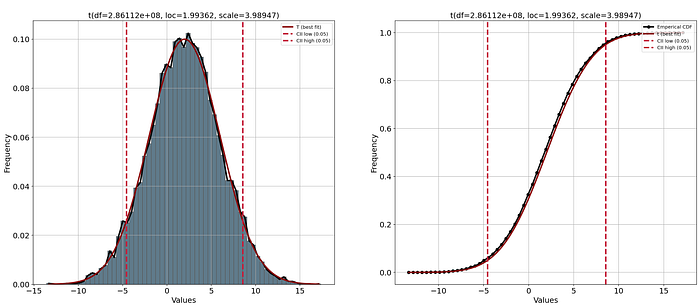
We can also plot all other estimated theoretical distributions with the n_top parameter. With a visual inspection, we can confirm that the top distributions have a very close fit with the empirical data. Note that the bootstrap approach revealed that not all fits were stable. The distributions in the legend of the plot are ranked from best fit (highest) to worst fit (lowest). Here we can see that thedweibull distribution has a very poor fit with two peaks in the middle. Using only the RSS score would have been difficult to judge whether or not to use this distribution. The distributions uniform, exponent, and pareto readily showed a poor RSS score and is now confirmed using the plot.
# Create subplot
fig, ax = plt.subplots(1,2, figsize=(25, 10))
# Plot PDF with histogram
dfit.plot(chart='PDF', n_top=11, ax=ax[0])
# Plot the CDF
dfit.plot(chart='CDF', n_top=11, ax=ax[1])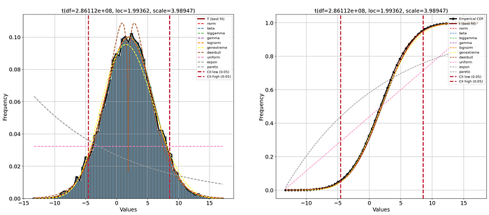
Quantile-Quantile plot.
There is one more plot that we can inspect, such as the QQ plot. The QQ plot compares the empirical probability distributions vs. the theoretical probability distributions by plotting their quantiles against each other. If the two distributions are equal, then the points on the QQ-plot will perfectly lie on a straight line y = x. We can make the QQ-plot using the qqplot function (Figure 5). The left panel shows the best fit, and the right panel includes all fitted theoretical distributions. More details on how to interpret the QQ plot can be found in this blog [2].
# Create subplot
fig, ax = plt.subplots(1,2, figsize=(25, 10))
# Plot left panel with best fitting distribution.
dfit.qqplot(X, ax=ax[0])
# plot right panel with all fitted theoretical distributions
dfit.qqplot(X, n_top=11, ax=ax[1])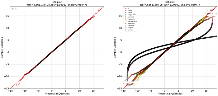
Identify The Best Distribution Using Non-parametric Fitting.
Non-parametric density estimation is when the population sample is "distribution-free" meaning that data do not resemble a common theoretical distribution. In distfit, two non-parametric methods are implemented for non-parametric density fitting: the quantile and percentile methods. Both methods assume that the data does not follow a specific probability distribution. In the case of the quantile method, the quantiles of the data are modeled, which can be useful for data with skewed distributions. In the case of the percentile method, the percentiles are modeled, which can be useful when data contains multiple peaks. In both methods, the advantage is that it is robust to outliers and do not make assumptions about the underlying distribution. In the code section below, we initialize using the method method='quantile' or method='percentile'. All functionalities, such as predicting and plotting, can be used in the same manner as shown in the previous code sections.
# Load library
from distfit import distfit

# Create random normal data with mean=2 and std=4
X = np.random.normal(2, 4, 10000)

# Initialize using the quantile or percentile approach.
dfit1 = distfit(method='quantile')
dfit2 = distfit(method='percentile')

# Fit model on input data X and detect the best theoretical distribution.
dfit1.fit_transform(X)
dfit2.fit_transform(X)
# Create subplot
fig, ax = plt.subplots(1,2, figsize=(25, 10))

# Plot the results
dfit.plot(ax=ax[0])
dfit.plot(ax=ax[1])
Identify The Best Distribution For Discrete Data.
In case the random variables are discrete, the distift library contains the option for discrete fitting. The best fit is derived using the binomial distribution. The questions can be summarized as follows: given a list of nonnegative integers, can we fit a probability distribution for a discrete distribution, and compare the quality of the fit? For discrete quantities, the correct term is Probability Mass Function (PMF). As far as discrete distributions go, the PMF for one list of integers is of the form P(k) and can only be fitted to the binomial distribution, with suitable values for n and p, and this method is implemented in distfit. See the code section below where a discrete dataset is created with n=8 and p=0.5. The random variables are given as input to distfit which detected the parameters n=8 and p=0.5005, indicating a good fit.
# Load library
from scipy.stats import binom
from distfit import distfit

# Parameters for the test-case:
n = 8
p = 0.5

# Generate 10000 randon discrete data points of the distribution of (n, p)
X = binom(n, p).rvs(10000)

# Initialize using the discrete approach.
dfit = distfit(method='discrete')

# Find the best fit.
dfit.fit_transform(X)

print(dfit.model)
# {'name': 'binom',
#  'model': <scipy.stats._distn_infrastructure.rv_discrete_frozen object at 0x000001C68D7148F0>,
#  'params': (8, 0.5005515351415117),
#  'score': 0.00010141333731801194,
#  'chi2r': 1.4487619616858849e-05,
#  'n': 8,
#  'p': 0.5005515351415117,
#  'CII_min_alpha': 2.0,
#  'CII_max_alpha': 6.0,
#  }
# Make predictions
results = dfit.predict([0, 2, 8])
Plot the results with the plot functionality.
# Plot the results
dfit.plot()

# Change colors or remove parts of the figure.
# Remove emperical distribution
dfit.plot(emp_properties=None)
# Remove PDF
dfit.plot(pdf_properties=None)
# Remove histograms
dfit.plot(bar_properties=None)
#Remove confidence intervals
dfit.plot(cii_properties=None)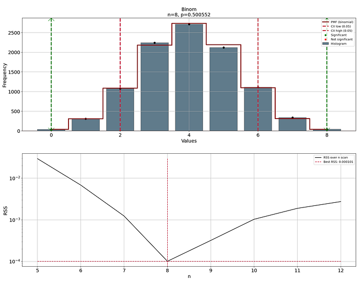
Applications Of Distribution Fitting.
Knowing the underlying distribution in your data set is key in many applications.
- Anomaly/novelty detection is a clear application of density estimation. This can be achieved by calculating the confidence intervals given the distribution and parameters. The
distfitlibrary computes the confidence intervals, together with the probability of a sample being an outlier/novelty given the fitted distribution. A small example is shown in the code section below.
# Import libraries
import numpy as np
from distfit import distfit

# Create random normal data with mean=2 and std=4
X = np.random.normal(2, 4, 10000)
# Initialize using the parametric approach (default).
dfit = distfit(multtest='fdr_bh', alpha=0.05)
# Fit model on input data X.
dfit.fit_transform(X)
# With the fitted model we can make predictions on new unseen data.
y = [-8, -2, 1, 3, 5, 15]
dfit.predict(y, todf=True)
# Print results
print(dfit.results['df'])
#      y   y_proba y_pred         P
# 0  -8.0  0.017455   down  0.005818
# 1  -2.0  0.312256   none  0.156128
# 2   1.0  0.402486   none  0.399081
# 3   3.0  0.402486   none  0.402486
# 4   5.0  0.340335   none  0.226890
# 5  15.0  0.003417     up  0.000569
# Plot the results
dfit.plot()- Synthetic data: Probability distribution fitting can be used to generate synthetic data that mimics real-world data [9]. By fitting a probability distribution using real-world data, it is possible to generate synthetic data that can be used to test hypotheses and evaluate the performance of algorithms. The code section below shows a small example of how to generate random variables from a normal distribution by estimating the distribution parameters. In-depth details can be found in this blog [9].
# Import libraries
import numpy as np
from distfit import distfit

# Create random normal data with mean=2 and std=4
X = np.random.normal(2, 4, 10000)

# Initialize using the parametric approach (default).
dfit = distfit()

# Fit model on input data X.
dfit.fit_transform(X)

# The fitted distribution can now be used to generate new samples.
X_synthetic = dfit.generate(n=1000)- Testing hypotheses: Probability distribution fitting can be used to test hypotheses about the underlying probability distribution of a data set. For example, one can use a goodness-of-fit test to compare the data to a normal distribution or a chi-squared test to compare the data to a Poisson distribution.
- Modeling: Probability distribution fitting can be used to model complex systems, including weather patterns, stock market trends, biological processes, population dynamics, and predictive maintenance. By fitting a probability distribution to historical data, it is possible to extract valuable insights and create a model that can be used to make predictions about future behavior.
- Optimization and compression: Probability distribution fitting can be used to optimize various parameters of a probability distribution, such as the mean and variance, to best fit the data. Finding the best parameters can help to better understand the data. In addition, if hundreds of thousands of observations can be described with only the
loc,scale, andargparameters, it is a strong compression of the data. - An informal investigation of the properties of the input dataset is a natural use of density estimates. Density estimates can give valuable indications of skewness and multimodality in the data. In some cases, they will yield conclusions that may then be regarded as self-evidently true, while in others, they will point the way to further analysis and data collection.
Final Words.
I touched on the concepts of probability density fitting for parametric, non-parametric, and discrete random variables. With the distfit library, it is straightforward to detect the best theoretical distribution for over 90 theoretical distributions. It pipelines the process of density estimation of histograms, estimating the distribution parameters, testing for the goodness of fit, and returning the parameters for the best-fitted distribution. The best fit can be explored with various plot functionalities, such as Histograms, CDF/PDF plots, and QQ plots. All plots can be customized and easily combined. In addition, predictions can be made on new unseen samples. Another functionality is the creation of synthetic data using the fitted model parameters. Overall, distribution fitting has great benefits when working in the field of data science. It is not only to better understand, explore, and prepare the data, but also to bring fast and lightweight solutions. It is good to realize that the statistical tests only help you to look in the right direction and that choosing the best model is not a statistical question; it is also a modeling decision. Choose your model wisely.
Be Safe. Stay Frosty.
Cheers E.
If you like the content, give it applause, and you are welcome to follow me because I write more about data science! Tip: the hands-on examples in this blog. This will help you to learn quicker, understand better, and remember longer. Grab a coffee and have fun! Disclosure: I'm the author of the Python package distfit library.
Software
Let's connect!
Terminology.
Definitions/terminology in this blog:
"Random variables are variables whose value is unknown or a function that assigns values to each of an experiment's outcomes. A random variable can be either discrete (having specific values) or continuous (any value in a continuous range)" [1]. It can be a single column in your data set for a specific feature, such as human height. It can also be your entire data set that is measured with a sensor and contains thousands of features.
Probability density function (PDF) is a statistical expression that defines a probability distribution (the likelihood of an outcome) for a continuous random variable [1, 6]. The normal distribution is a common example of a PDF (the well-known bell-shaped curve). The term PDF is sometimes also described as "distribution function" of "probability function".
Theoretical distribution is a form of a PDF. Examples of theoretical distributions are the Normal, Binomial, Exponential, Poisson etc distributions [5, 6]. The distfit library contains 89 theoretical distributions.
A Empirical distribution (or data distribution) is a frequency based distributions of observed random variables (the input data) [7]. A histogram is commonly used to visualize the emperical distribution.
References
- W. Kenton, The Basics of Probability Density Function (PDF), With an Example, 2022, Investopedia.
- P. Varshney, Q-Q Plots Explained, Medium 2020.
- Gamma Distribution, Wikipedia.
- A. Downey, Are your data normal? Hint: no. 2018, Blog.
- Probability Density Function, Wikipedia.
- List of Probability Distributions, Wikipedia
- Empirical Distribution Function, Wikipedia
- G. Jogesh Babu, Eric D. Feigelson, Astrostatistics: Goodness-of-Fit and All That!, ASP Conference Series, Vol. 351, 2006
- E. Taskesen, How to Generate Synthetic Data: A Comprehensive Guide Using Bayesian Sampling and Univariate Distributions. Towards Data Science (TDS), May 2025.
- E. Taskesen, What are PCA loadings and how to effectively use Biplots?, Data Science Collective (DSC), July 2025